Alejandro Paul writes the world over
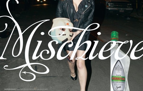
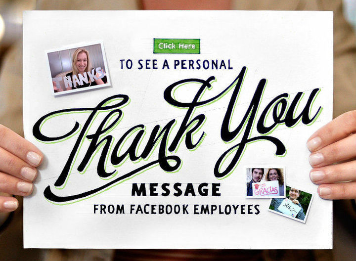
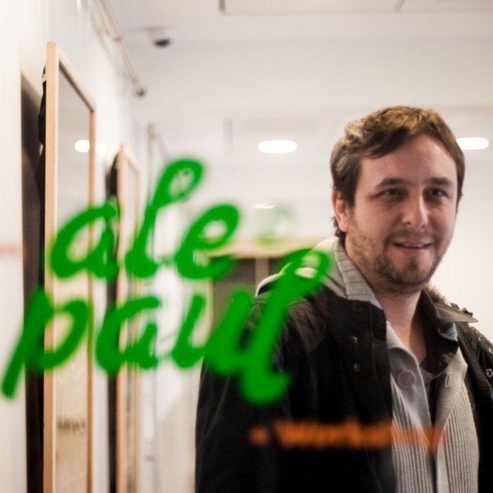
If there is one typographer you should keep an eye on, that is without a doubt Alejandro Paul. A quick look at his twitter just tells us everything: “Facebook says Thank You to 500 million users with a Sudtipos typeface“, “Elizabeth Arden and Burgues Script“, “Nabisco + Amorinda font” and the list keeps going. From small projects to government-size corporations, everybody is in love with Paul’s work and is not hard to understand why. From simple sans-serifs to meticulously built complex scripts, everybody has a typography waiting for them at Sudtipos – his type foundry based in Argentina. At the end of July we interviewed him briefly for this beloved website of yours; hopefully this will be just the beginning of a long lasting friendship spiced with letters, kerning and plenty of paragraphs. As a side note; translating this was a nightmare fellas, more and better English-Spanish dictionaries are needed.
Hi Ale! First of all, let’s start with an introduction: who are we speaking with?
I am Ale Paul, a graphic designer that went on to become typography designer. I’m also a father, a husband, a gourmet chef, music lover and fan of the River Plate.
What is Sudtipos, who are your partners and what kind of projects does Sudtipos do?
Sudtipos is a typography collective that started off in Buenos Aires around 2002 with the purpose of channeling our passion for typography. It was founded by four different designers who had each specialized in different areas of design. The group was formed by Diego Giaccone, a specialist in packaging; Ariel Garófalo, in editorial; Claudio Pousada in TV branding; and myself, during that time particularly focused in corporate branding and label design. Today several other designers have joined the project coming from various other Latin American countries, such as Laura Varsky, John Moore, Daniel Hernandez and Ariel Di Lisio.
When did you started creating typefaces? Which was your first typeface to be commercially sold? How many typefaces have you created until today?
I began when I was a design student. My first commercially sold typography was Stardust which was published by the T-26 foundry from Chicago. To date, I have created over 100 type families and all of them have been published in sudtipos.com
What are the typefaces you’re most proud of?
Every new letter is a challenge, I don’t see any sense in producing new stuff just because you want to make stuff. Nevertheless, if I had to pick one that would be Burgues Script due to its awards: Type Directors Club, Bienal Tipos Latinos, and many many publications.
How is the typography market nowadays?
Right now there is a lot of demand, but this is balanced by great supply as well. Also, I would say that the advancements in the piracy world and falsification techniques is playing against typography nowadays too. The market right now is really wide, ranging from housewives all the way to design professionals. You never really know who is going to buy one of your typographies!
How do you start creating a new typeface [ what do you do first, with which character do you start ], and how long does it take in average to create a typography?
I don’t start with any glyph in particular although I like to play with the ascender and descender letters. I begin with a mental idea, then some rough sketch on paper and then I go to the computer. I solve almost everything in the computer.
What are some of the most common mistakes you see in amateur typography?
A bunch of them! Unfinished alphabets, filled with badly located nodes, awful track-lettering and kerning, absence of kerning in diacritics. Moreover the bad imitation of successful projects. I’m really bothered by the people that want to make quick money by doing typography. They disrespect it and make it lose value.
In your opinion, what is the hardest part in the process of creating a typeface?
The initial idea.
What is the weirdest place where you’ve seen one of your typographies used?
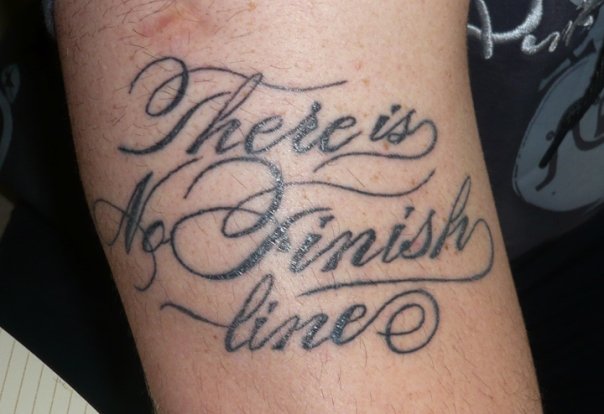
People’s bodies! I receive a lot of photographs of tattoos featuring my fonts. I am actually currently working on my own tattoo typography.
- Now on to quick, no-frills favorites:
What is your favorite character from all the alphabet and its symbols?
I really like the ampersand (&), and the letters “k”, and “g”…
Which type designer should be we keep an eye on?
Well, I would say keep an eye on history. Often we look at what we have now without really knowing anything about past designs and concepts. There is a lot to be admired, even from the beginnings of typography itself.
Which typography you wish you had created?
I would have loved to be George Bickham or at least created the Bickham typography!
Which brand has a use of typography that you like?
Blue Note. The record sleeves of that label make me flip, specially in the Ried Miles era.
And to finish: how many typographies do you have in your computer nowadays?
My own, those of typographer friends that send them over as a gift and those that came with the operative system .
Thanks!





Leave a Reply